Thursday, 1 November 2012

Advert designs

This draft for the advert of our band can be seen below.

I have decided to go for a very simple and clear design for the advertisement. Instead of showing an abstract object or design, which some bands choose to do, I have decided to just show the band itself (as this is what our audience wanted when we sent out our survey earlier in the year). 
As you can see the band name will be very large in font, to make it stand out and allow for passers by the really remember the band name, which is key for a band of such small size. Also, each band member will be either holding their instrument (guitar or microphone) or something related to their role in the band (such as drum-sticks). This will instantly show to the audience who does what in the band, allowing them to get a feel for the band itself and their members.
The CD cover of the band will also be shown on the advert, to again promote the band and their product. To further promote the Cd and the band, critic reviews will be placed on the advert to really show to the audience that although they may be indie and unknown, they are high in quality which can be seen by the critic comments.
Lastly, general information about the band and their CD, such as: where to purchase, release date and the record label that the band are associated with can also be seen on the advert.


CD cover designs

Below are scanned in documents of a draft of the CD cover for our band. 

For the back of the CD cover, I have decided to use an picture of the whole band together. Although I have chosen to show the band members sitting of a sofa/couch together, any sort of environment can be used. By showing the band together like this it shows the unity of the band and how each member is valued by each other, and that one member is more important than any others, which can be the case in some bands. 

For the section where the actual CD will be placed in the package, I have decided to use a very simple but effective concept. I have chosen to show a variety of the instruments and other related objects to a rock band, scattered on a table or other flat surface. This idea takes inspiration from the CD cover 'Section 80', where it also uses a similar idea, with objects scattered on a table, it is very effective but simple at the same time. This shot will be from a birds-eye angle, giving a real panoramic feel the the shot. Furthermore, in the centre of the CD itself I have decided to use the circular part of a microphone. This will give a sort of graphic match, and can also give the idea that the microphone and the lyrics of the song are central to the band, meeting the convention of the indie-rock genre that the music and the band itself are the most important part, when it comes to creating a video, CD or advert.

Section 80 CD cover:


Scanned documents:


Lists of props, costumes, make-up and equipment

gif creator online

Sunday, 21 October 2012

Storyboards


Me and my group have created storyboards to help give us an idea of what different shot types and different angles that we would like to use in our video. It also allows us to gain an idea of how much of the concept we would like to show, in comparison with the performance section of our video.
Our storyboard has changed from our initial ideas, as we have chosen to use a slightly different concept to the one we had planned. The old concept was one of relationship breakdown and how the two characters were coping and overcoming the breakup. However, we decided to change this as our video could end up being very cliche and repetitive, as many music videos have done this previously. By changing the concept to one centred around the idea of 'searching', it allows us to be more creative and experimental in what we can show on screen, which in turn will ensure that our music video doesn't get repetitive and tiresome for the audience.

Below is a short video showing me and my group producing our storyboards:


Below are images of the completed storyboards:


We then created an animatic of our storyboard. This allowed us to present in a visual and interesting way what we wanted to show on screen and when. By doing this it also gave us some structure as it helped us to visualise and get an idea of what we want to accomplish in our music video.


Wednesday, 17 October 2012

Concept

The concept that me and my group have chosen to use in throughout our music video is one based on the idea of 'searching'. We aim to create the idea that the characters in our music video our searching for something, however we hope to keep this something concealed. This is because this will allow the audience to speculate what it could be and what the characters are doing. By doing this it will allow us to create some sort mystery in our video, which will in turn help to make our video much more interesting for the viewer to watch.
By using a concept rather than a narrative throughout our video it allows the band/artist to be the main focus of the music video, which is one of the conventions of an indie rock video, as promoting the band/artist and the music that they play is key in a music video of our chosen genre.
Although this may go against the spatial and temporal features of Bordwell and Thompsons theory, it does allow us to use a larger variety of locations, costumes etc. which will again keep the audience hooked as they may grow tired of the same repetitive location and costume. However, rhythmic and graphic editing is something that will feature predominantly in our music video, as cutting on the beat is something that happens frequently in indie rock music videos. This, featured in Goodwins theory, matches the sense of illustration, where cutting on the beat helps to give a sense of rhythm and timing.

Locations
We have chosen to use several locations in our music video:

  1. The first and most important location that we have chosen to use is a setting where the band/artist will be playing. We have decided to use a stage type location, however we want it to have an abstract feel so may decide on a basement, summer house type location instead which could allow us to be more creative and interesting, which will help the video. Lighting will play a big part in this location as we want to make the band/artist still be the focus, meeting the convention of an indie rock music video.
  2. We also chose to use various locations to show the two main characters 'searching' to help meet our concept for the video. These shots will not have one set location, with a variety used to help make sure the locations don't become stale and redundant.
  3. An outside location (such as a park) may also be used to show the two main characters running. This will again create the sense of 'searching' (matching out concept), however we aim to make sure that it will be mysterious and abstract as to what they will be searching for.
Costumes
Again, like the locations, we have chosen to use several different costumes in our music video:
  1. The first costume in our music video will be for the main singer when he is performing. We have chosen to again follow the conventions of our chosen genre when it comes to what the people on screen will be wearing. We are looking to meet the geek preppy look, which is a formal and also casual look, which is used in many indie rock music videos. This look will contain items of clothing such as: flannel shirts, V-neck sweaters, chinos, skinny ties and boat shoes/plimsolls. 
  2. The second costume will be very similar to the costume stated above. But because this time the costume will be for the concept section of our video (with characters 'searching'), the costume will be slightly more casual with skinny jeans replacing chinos and hoodies replacing V-neck sweaters, to not only give the costume a more casual feel, but also mix up the different styles of clothing to make sure the audience become tired of seeing the same thing.
  3. The last costume used in our music video will be for the female character in the concept section of the video. The costume for the female will match that of her male counterpart, with sweaters, tights, plimsolls, shorts/skirts and 'geeky glasses' used to again give the video that indie and abstract feel.

Special Effects
In our music video special effects will not feature predominantly as it may distract the audience away from what the video is really about, the band/artist itself. However, slow motion and sped up shots can be used in the video (especially when instruments are being payed) to help mix up what is being shown on screen and to maintain the audiences focus on the video. We have decided not to use many special effects as it can sometimes make the video seem unprofessional if not done to a high enough standard and would also not meet the conventions of an indie rock video, as the main focus is one the band/artist themselves, rather than special effects such as contrasting colours etc.

Sunday, 14 October 2012

Image Annotation

Below are a variety of images showing the type of fashion and clothing that me and my group are going to be using in our music video. The clothes that you can see will be used by not only the performer but also the characters of the concept that will be used in the music video.


The clothing that we have chosen to use in our video help to reflect the conventions of our genre well, when it comes to the clothing of the videos.
The clothes above can be seen as both formal and casual with ties and shirts worn, but the outfits are given a casual edge mainly by the use of footwear in the form of plimsolls and boat shoes. By meeting this convention it allows the image of the band/artist to appeal to a variety of different audiences with the two different styles of clothing incorporated into their outfits.
Colours of the clothing pieces are very plain, basic and earthy. This is to ensure that the main focus of the music video is on the instruments and the lyrics of the song rather than the audience being totally focused on the outfit of the band/artist.
The main focus of the image of our band/artist will be revolved around the instruments used in the video (predominantly guitar and drums), to allow the audience to get a feel for the music and lyrics of the song, which will help audience to remember the band and the songs they make.
Lastly, the clothes associated clothes with the indie-rock genre are very fitted, rather than baggy and loose. This is because baggy clothing is mostly associated with rap and hip-hop music, whereas having a more fitted style of clothing it allows the audience to instantly recognise the band/artist as consisting of the rock genre.


Below is several images, showing how this image and style is also used by bands/artists in the present day.


gif online animator


As you can see, the clothing and style of the bands in the images above also meet the conventions of an indie-rock band, and this is what we hope to shape the image of our band/artist around.

Research Teacher Assessment

Below is an assessment sheet from one of my teachers. As you can see the mark, level and grade of this assessment matches the peer assessment, also carried out on the research section of my blog. Although I am on the way to meeting my target grade of an A, there are still some improvements that have to be added to my blog to ensure that it is the best it can possibly be and that it also allows me to securely achieve my target grade.


Tuesday, 9 October 2012

Lyrics Annotation

Below is an annotation of the lyrics of my chosen song for my indie rock music video (which can be seen from the previous post:


Although many of the annotations are based on the narrative and concept of out music video, which will revolve around the idea of a relationship breaking down and ultimately coming to an end.
However, the singer/band themselves will also be a key part of the music video, but the use of the singer/band will be used as the main location and focus of the video, whereas the narrative will be second to that focus. 
So it was key to show the different aspects of the narrative in the annotations above, as we as a group have already decided that the singer/band will be the focal point of the video. 


Below is a short video showing a mind map that our group made showing the different aspects that we would like to include in our music video:


Song Details

Below is the song that me and my group have chosen to use for our indie rock music video:


As you can hear from the song above, it falls perfectly into the genre of indie rock, which ensures that the conventions that we have researched can be met when creating the music video.
We have also chose this song as the lyrics of the song can be used to create a clear concept to the video, which can help give the video itself some structure to it, and also make it interesting for the viewer to watch.
Another reason for choosing this specific song is that the beat is fairly quick and fast which can allow the editing to match the beat of the song, which will again make the video more fun for the viewer to watch.
Lastly, the song has a clear emphasis on the instruments, with parts of the song being just the instruments being played. This will allow us to meet the convention of the band/artist being the focal point and emphasis of the video, which will help to create a successful indie rock music video.

Monday, 8 October 2012

Technical Tutorials - Photoshop Practice

Below is a short video showing some of the techniques and skills that I have learnt from using photoshop. These skills include adding saturation to an image, how to blur an image, how to add text to an image, and how to remove the saturations placed on an image.


Below is a practice CD cover that me and my group made on photoshop, using the new skills that we had learnt from using the software.


The CD cover that we produced has some key features to it that match the conventions of our chosen genre:

  • The background colour of our CD cover is an earthy green, which matches the convention of having natural and neutral colours as the backdrop of the CD.
  • The font used is also very unique and catches the attention of the audience, which again is a convention of our chosen genre as it helps the CD to stand out from the rest.
  • Although the colour of the font is black (which is a convention), an effect known as 'outer glow' was placed on the text to make it stand out even further and again try and catch the attention of the audience. The white glow also helps the text to stand out from the background colour also, which helps the audience to clearly see the name of the artist and the album title. By doing this is allows these two things to stick in the mind of the audience, which is a key thing when creating a CD cover.
  • Mid shots of the artist is used, which makes conventions of our genre, especially when it is a solo artist and not a band, as the one person is the main focus of the cover and by using these mid shots it allows the convention to be met.
  • The clothing used in the CD cover also matches that of artists in the indie-rock genre, as hoodies and chinos is a key part of their fashion, and again by matching this it also allows the audience to relate to the artist, as the audience will most likely have a similar taste in fashion to that of the artist.
  • An 'under water' effect was also placed on the CD cover, which links to the colour used for the background of the cover as it helps to again give the cover a natural and neutral feel.
  • There is also consistency of design throughout the CD cover, which helps the audience to gain a feel for what the audience is about, and also presents the cover itself as clear and understandable from the simplicity used.
  • Lastly, barcodes and record label finish off the CD cover, and meet the last of the conventions of an indie rock CD cover, as these two things are essential to have when creating a CD cover.


Tuesday, 2 October 2012

Technical Tutorials - Green screen practice

Below is a test music video that we created using a green screen, although the quality of the editing and the shots may not be the highest, we had a very short time period to get it all done. And the main priority of doing this task was to help us gain experience with using the green screen (both setting up and in terms of the editing), which we can now consider to use in our final music video to help add another dimension to it visually.


The tasks helped me to learn a lot of new skills that will help me in the production of my final indie-rock music video:
  • Setting up the green screen itself and the lighting, and also dismantling it, both quickly and safely.
  • Having more of a consideration of how important lighting is in a music video environment, especially when using a green screen, as consistent lighting is very important.
  • How to stay on schedule and keep to a strict time limit, as in my final music video I will have to make sure I am sticking to my schedule and getting all aspects done all time to keep the process efficient.
  • How to use the chroma keyer effect on Final Cut Express, which allows you to insert any background you want behind the video, (which can be seen in the video above with the dance floor scene).
  • I have learnt how to line up the video and audio of the music track, by using markers to help allow me to see when the singing may start on the audio and when the actor on screen will mime in time.

Roles

Below is a short video, showing me and my group stating the roles that we will be performing in the production of our indie-rock music video.


Although we will all be performing the roles of director, camera operator and editor, I specifically will be responsible for carrying out the props, lighting and I will also be participating in the video itself as an actor.


Initial Ideas

Below is a mind map showing the initial ideas of me and my group about certain aspects of our indie rock music video:


As you can see we have quite a lot of ideas of what we want to include in our music video.
Of course out chosen genre in indie rock, and we have centered all of our other ideas around the conventions of this genre.

Locations
For the locations of our music video we have decided to keep it fairly simple with a studio and stage location being the main locations used. However, we thought about using maybe a couple more different dynamic locations, such as a street (noted above) to make the video more interesting for the audience to watch, and also adding a more natural and real life element to it.

Low-key lighting
We decided to choose predominantly low-key lighting, with a lot of earthy colours used to help create a calm but also mysterious feel to the video. By using low-key lighting it also allows us to work with the shadows that it may create, which can help to make our video more creative.

Costumes
The costumes that we have decided on, is clothes that are both formal and casual, such as flannel shirts and boat shoes, which look smart but are also casual and fashionable at the same time. By using these types of clothes it will allow us to appeal to a lot of different audiences, each with different fashion tastes.

Props
Again in this department we have decided to keep the props simple with instruments and microphones being the main focus of the props. We have decided to include props that may be appropriate to the narrative/concept of the video, to again make it more interesting.

Artists
The artists that we have moulded our ideas around include both solo artists and bands. However they do have common factors in all of their images, such as the clothes they wear and the props they use (instruments being the main focus), which we also hope to follow in our video. The artists all have simliarities, but choosing the correct artist that matches our chosen best is key to creating a successul music video.

Sunday, 30 September 2012

Research Peer Assessment


Below is a peer assessment from one of my classmates regarding the research portion of my blog. As you can see from the mark and grade from my peer, I am on track to achieving my target grade.
There are however some improvements that I do need to make to my blog to make sure that it is the best it possibly can be. The improvements can be seen by both images and as you can see improvements have also been noted on the back of the sheet, showing that there are a number of improvements that have to be made.


Thursday, 27 September 2012

Audience Research 2


These two graphs show the demographics of the people who answered our survey. The age (right) and gender (left) can be seen below. These two graphs also show me that my target audience from this survey is females, aged between 17-19 years old, allowing me to gain a grasp of who the majority is, and what I should tailor my project towards.


These next two graphs, allow me to gain an insight to what kind of music listener and music fan my audience is. I asked in my survey how they find out about music trends and news and also how they purchase their music. The overwhelming response was that more digital and modern techniques such as radio and YouTube are used to find out about music instead of conventional magazines and also work of mouth. Furthermore this trend carries onto the other question of my survey, as another overwhelming response showed that people of my audience buy their music via iTunes etc. rather than buying the physical copy.
This shows to me that the music audience in today’s society are much more modern and technological when it comes to music, allowing me to use this when making my project.


Asking what the recipients favourite genre of music was, was a very simple but key question to ask, as it allowed me to see what the majority of people wanted (which was indie-rock) – which in turn allowed me to use their answers to following questions much more effectively, knowing that they were coming from a real fan of the genre that I am pursuing.


The next two questions referred to the music video that I will be creating and what the audience prefer to see in indie-rock music videos.
As you can see when it came to the story line and concept of the music video itself, the majority preferred to have a narrative with the band members being central characters in the story. Furthermore, having a live performance from the band was also a popular answer. This combination of answers means that by combining these two things may be beneficial for both me and my group and the audience, as it is what they want to see and allows us to create a successful video in meeting audience needs.
The second question we asked was to do with the editing of the video itself. Again the majority wanted a video that cuts on the beat, creating a sense of rhythm and tempo, with a lot of people also wanting a fast-paced editing style. Again by combining these two things it will help to create the best music video possible.


Next, I asked what the audience prefer to see on the cover of an indie-rock CD cover. This was a very simple but again important question to ask as there are two routes to choose when making a Cd cover, whether to have the band or an image on the front cover. 
However, the response was unanimous in favour of having the band on the front cover.


Lastly, I asked if the audience would like the advertisement for the band to match the design and style of that of the CD cover. Again like the last question the response was unanimous in favour of having both the CD and advertisement to match in design and style.


In conclusion, from looking at my results I can tell that my ideal target audience is female, aged between 17-19 and likes indie rock music. They also use modern techniques to find out about and also obtain their music, which tells me that they are very up to date with their music and thus may want to see modern techniques used in the music video.

Overall, by carrying out this survey it has allowed me to understand what the audience for the genre of indie-rock want to see in a music video, CD cover and advertisement. This is invaluable information as it allows me and my group to fully meet the needs and desires of the audience, ensuring the project is the best it can possibly be.

Tuesday, 25 September 2012

Audience Research 1

Below is a survey that me and my group created. The survey was sent to a large list of people, to help give us a view of what people wanted to see in our music video, CD cover and magazine advertisement.


Because this survey was sent to people in our year group, a specific demographic range will be answering the survey. This is good as it meets the target audience of our genre and allows us to see exactly what they like to see, and what they don't like to see to allow us to tailor everything to what they want. I expect to see certain results, such as the age and what music they are interested in, as we are sending the survey to a particular demographic. However, some of the more in depth answers will give me and my group a true understanding of what they like and don't like. This survey will also allow us to identify trends and patterns in the answers which will allow us to get an idea of what the majority of people want. I also hope that the in depth answers give us ideas that we may not have thought of as a group, again to make our products the best that they ca possibly be. Also, we have sent our survey to some teachers. This will give us an opinion from a different demographic who may have different opinion and ideas, which can also be used to create the best project. By combining the opinions and ideas of these two different demographics, it will allow us to really appeal to our audiences and produce the best project possible.

Friday, 21 September 2012

Advertisement Research

Below are three advertisements from my genre of indie rock. Highlighted are the key features of the advertisements and what makes then unique or similar:


As you can see from above their are some clear conventions associated with advertisements for indie rock CD's:
  • They all use dark backgrounds, either black or dark blue etc. which acts as a backdrop for all of the other features.
  • Large font is used to state the band name/CD title. The colour of this is mainly white, again to ensure that it stands out from the dark background used. The font style used is also unique in style, matching the genre of indie rock.
  • Information about the CD itself matches the font colour (and usually the style as well). Key points about this information, such as release date or song names are made bold to stick out from the rest of the information and to stick in the minds of the audience.
  • Lastly and most predominantly, a large abstract image is used (mainly in the centre of the advertisement) this is usually unrelated to the rest of the advertisement and is used purely for aesthetic reasons to help draw the audience in and make the advertisement stick out from the rest.

By looking at these advertisements it has shown me that many indie rock bands/artists today tend to use abstract images rather than showing off the members themselves, as this helps to catch the eye of the audience more as they may not recognise the band members and so may ignore the advertisement because of this. 
The research that I have carried out into the advertisements of indie rock bands will help to give me ideas when I have to create me own advertisement, as having clear colours and images is something that is simple but very effective when creating an indie rock advertisement. 

Record Label Research

Thursday, 20 September 2012

CD Cover Research

Below are 3 CD covers (front and back) from the genre of indie rock, and the key features of them:


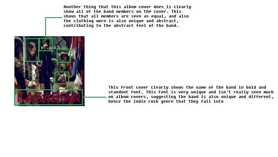
This CD cover has a lot of abstract imagery used, which can be because the band 'Kasabian' are very well known in the indie rock scene, and so they can get away almost by using this abstract and different approach that most unknown bands/artists may not be able to use effectively.
Although the front cover has a very abstract feel, with band members wearing very traditional and old-fashioned clothing, it does clearly show to the audience who is in the band, allowing then to recognise and familiarise themselves with the band members.
Compared to the 'Razorlight' CD cover (shown below), much darker and more sinister colours are used throughout the cover, which automatically helps the audience to draw a clear distinction towards the two bands. As although they may both be part of the indie rock genre, it is clear from both the representation of the bands through their CD cover and their music itself they have different moods and atmospheres, separating the two.
The font used in this CD cover is again like the 'Razorlight' very clear to read, but has a much more rougher and harder feel to it, with straight lines used, instead of more curved lines used in the 'Razorlight' CD cover. This gives 'Kasabian' a more rougher and darker tone to the band itself due to this chosen font.


This CD has a clear meaning and concept to it. Because the band may not be well-known (or at least at the time of release), clearly showing the band members themselves on the front of the cover allows the audience to recognise and become used to seeing the members, which can help to get there name out there and become more popular and known in the public eye.
Furthermore, clear colours are used to back up the previous point, as it helps the band themselves to stand out and help them become recognisable.
The font style and colour are very simple and allows the important information to stand out from the also simple background colour. By having a single colour front and back of the CD cover it allows the simple style of the whole CD cover to be applied throughout the whole cover, keeping it consistent. The font style also matches the clear layout, as a easy to read font is chosen to again help keep the layout and style of the CD cover consistent throughout.


Lastly, this CD cover has again like 'Kasabian' a very abstract and different image used as the front cover. Again, it does show the band members off slightly, but the main focus is off the owl image used in the centre of the cover, which matches the title of the CD itself ('Only By The Night').
The colours used on the CD cover are very similar to that used in the 'Kasabian' cover, as they are much darker in the tone, especially the front cover. Whereas the back of the CD cover uses a simple white background, which contrasts with that of the front colour. It does however allow the font of the track list to stand out even further.
The font itself, on the back of the cover, is very different and bold and allowing the song titles to stand out, which can attract the audience. The colours, similar to the font, are also very bold in colour, which further allows the song titles to stand out. However, on the front of the cover, the font used for the band name and CD name are very small, which allows the main focus of the CD cover to be on the image itself, rather than the text, which allows for the CD to be very eye-catching and attractive.


These 3 CD covers have a few things in common with each other. All three show of all of the band members. The genre of indie rock is unlike the pop or dance genre, as it doesn't tend to use abstract images, instead they present the whole band together which allows the audience to see everybody. 
They also all have all information associated with a CD cover, such as record label that the band is associated with, the barcode and band website. Although these things are very obvious, they are essential for creating a successful CD cover that looks professional and is also informative for the audience and gives them places to go if they are in search of extra information.
Also, some of the CD's do use some sort of abstract features in the CD cover. Kasabian and Kings of Leon both use abstract features in their CD cover, either in the clothing worn by the band members, or the way they are presented, with the Kings of Leon album presenting the band members as part of an eagle head. 
The covers also use similar colours, with plain colours used, such as white, black, dark blue and dark green used. This keeps the tone of the album fairly neutral and not too in your face and garish, again like pop and dance CD covers.
Overall, indie rock CD covers are fairly simple in their execution but very effective as it presents the band well and keeps the tone of the album neutral to appeal to a wide variety of audiences, which allows these bands to get their music out to a lot of people, increasing their popularity.

Genre Research 3

Genre Research 2


Sunday, 16 September 2012

Genre research 1

Below is a mood board showing the image of the genre indie rock and how singers/bands of this genre are presented:


A lot of the indie rock look is based around clothes and fashion. The clothes that members of this genre wear are fairly formal but with a fashionable edge, such as the flannel shirts seen in the moodboard. These shirts are formal as they are fairly smart, but are fashionable with the checkered style on them it also allows them to be stylish at the same time. These stylish shirts contrast with the footwear worn by members though, with beat up vintage trainers used, which are also stylish and also ensures that members stand out from the crowd and are individual. It also makes sure they aren't presented as too smart, which isn't part of the indie rock scene. Another style convention of indie rock bands are that they have much longer style hair than other genres, again this has become a very fashionable style to adopt in todays society and has quickly been a part of the indie rock scene. Festivals are also a big component of indie rock, one of these festival posters can be seen above. Festivals have become a place where indie bands can show of their skills and appeal to a much larger audience, it also allows audiences to see new rising stars, with festivals such as Reading and Leeds showing off many indie rock bands, which is always popular. Lastly, instruments and the ability to play instruments is key to the indie rock scene. As you can see above their are many different techniques and stlyes to playing instruments, particularly guitar, which makes people seem unique and different and makes them easily recognisable by their fans.

Thursday, 13 September 2012

Theories 3

Below is a bubbl outlining the key ideas of Andrew Goodwin's theory towards editing:


Illustration
In this example, shots of images that relate to the lyrics are used, such as a microphone and a sound mixer. This is very simple but effective as it clearly portrays the lyrics and meanings over to the audience. The lighting used in these shots are also lit very well, adding to the simplicity of the music video. The editing used in the video, as stated in Goodwin's theory cuts on the beat, making the atmosphere very upbeat and full of rhythm. And lastly, the music star in the video is dressed as he usually is, again meeting the theory of Goodwin.


In this second example it also meets all of the criteria of Goodwin's theory. In this example simple shots of objects that again match what is being said in the song are used, this is simple but with good framing and lighting it makes it very effective. Also, in the video the music star is dressed how the audience expect her to be, which is a teenage school girl. Again this meets the lyrics of the song, making it very effective, simple and clear.


Amplification
The next two examples are from the same band. This links with the point Goodwin made, that established music stars are more likely to make quirky and different films as there is less of a risk. In these two music videos the band characters play fictional characters that relate to the concept/narrative of the music video (in this case an airplane flight and the other a man on his way to band practice). Because these videos are so different, they stay in the mind of the audience and are more likely to come back and watch the video again and again.


Disjuncture
In this example there is a clear disjuncture feeling with the music video. As you can see by the images below, the main character is presented as a nerd, this completely contrasts with how she is in real life, which is a glamorous music star known world wide. This world wide known stardom is one of the reasons that she can get away with making a music video such as this, as it is seen as less of a risk, as her fans are sure to like it. The mise en scene and performance of the music star is a key reason why this video is so effective, as without it the presentation of her being a nerd would not be so realistic or believable.


In this example, again the band members play roles that are the complete opposite of them in real life. The band members are male but instead play the role of women in the music video. This created a comical element to the video, making the audience laugh and remember the video for its quirkiness. Again the band are well established, so they take no risks in doing a disjuncture music video. Videos are like these are very effective as they are very memorable and become instant classics, meaning they are more appealing and attracting towards the audiences.