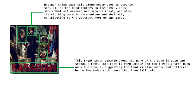
This CD cover has a lot of abstract imagery used, which can be because the band 'Kasabian' are very well known in the indie rock scene, and so they can get away almost by using this abstract and different approach that most unknown bands/artists may not be able to use effectively.
Although the front cover has a very abstract feel, with band members wearing very traditional and old-fashioned clothing, it does clearly show to the audience who is in the band, allowing then to recognise and familiarise themselves with the band members.
Compared to the 'Razorlight' CD cover (shown below), much darker and more sinister colours are used throughout the cover, which automatically helps the audience to draw a clear distinction towards the two bands. As although they may both be part of the indie rock genre, it is clear from both the representation of the bands through their CD cover and their music itself they have different moods and atmospheres, separating the two.
The font used in this CD cover is again like the 'Razorlight' very clear to read, but has a much more rougher and harder feel to it, with straight lines used, instead of more curved lines used in the 'Razorlight' CD cover. This gives 'Kasabian' a more rougher and darker tone to the band itself due to this chosen font.
This CD has a clear meaning and concept to it. Because the band may not be well-known (or at least at the time of release), clearly showing the band members themselves on the front of the cover allows the audience to recognise and become used to seeing the members, which can help to get there name out there and become more popular and known in the public eye.
Furthermore, clear colours are used to back up the previous point, as it helps the band themselves to stand out and help them become recognisable.
The font style and colour are very simple and allows the important information to stand out from the also simple background colour. By having a single colour front and back of the CD cover it allows the simple style of the whole CD cover to be applied throughout the whole cover, keeping it consistent. The font style also matches the clear layout, as a easy to read font is chosen to again help keep the layout and style of the CD cover consistent throughout.
Lastly, this CD cover has again like 'Kasabian' a very abstract and different image used as the front cover. Again, it does show the band members off slightly, but the main focus is off the owl image used in the centre of the cover, which matches the title of the CD itself ('Only By The Night').
The colours used on the CD cover are very similar to that used in the 'Kasabian' cover, as they are much darker in the tone, especially the front cover. Whereas the back of the CD cover uses a simple white background, which contrasts with that of the front colour. It does however allow the font of the track list to stand out even further.
The font itself, on the back of the cover, is very different and bold and allowing the song titles to stand out, which can attract the audience. The colours, similar to the font, are also very bold in colour, which further allows the song titles to stand out. However, on the front of the cover, the font used for the band name and CD name are very small, which allows the main focus of the CD cover to be on the image itself, rather than the text, which allows for the CD to be very eye-catching and attractive.
These 3 CD covers have a few things in common with each other. All three show of all of the band members. The genre of indie rock is unlike the pop or dance genre, as it doesn't tend to use abstract images, instead they present the whole band together which allows the audience to see everybody.
They also all have all information associated with a CD cover, such as record label that the band is associated with, the barcode and band website. Although these things are very obvious, they are essential for creating a successful CD cover that looks professional and is also informative for the audience and gives them places to go if they are in search of extra information.
Also, some of the CD's do use some sort of abstract features in the CD cover. Kasabian and Kings of Leon both use abstract features in their CD cover, either in the clothing worn by the band members, or the way they are presented, with the Kings of Leon album presenting the band members as part of an eagle head.
The covers also use similar colours, with plain colours used, such as white, black, dark blue and dark green used. This keeps the tone of the album fairly neutral and not too in your face and garish, again like pop and dance CD covers.
Overall, indie rock CD covers are fairly simple in their execution but very effective as it presents the band well and keeps the tone of the album neutral to appeal to a wide variety of audiences, which allows these bands to get their music out to a lot of people, increasing their popularity.


No comments:
Post a Comment