Below is a survey that me and my group created. The survey was sent to a large list of people, to help give us a view of what people wanted to see in our music video, CD cover and magazine advertisement.
Because this survey was sent to people in our year group, a specific demographic range will be answering the survey. This is good as it meets the target audience of our genre and allows us to see exactly what they like to see, and what they don't like to see to allow us to tailor everything to what they want.
I expect to see certain results, such as the age and what music they are interested in, as we are sending the survey to a particular demographic. However, some of the more in depth answers will give me and my group a true understanding of what they like and don't like. This survey will also allow us to identify trends and patterns in the answers which will allow us to get an idea of what the majority of people want. I also hope that the in depth answers give us ideas that we may not have thought of as a group, again to make our products the best that they ca possibly be.
Also, we have sent our survey to some teachers. This will give us an opinion from a different demographic who may have different opinion and ideas, which can also be used to create the best project.
By combining the opinions and ideas of these two different demographics, it will allow us to really appeal to our audiences and produce the best project possible.
Tuesday, 25 September 2012
Friday, 21 September 2012
Advertisement Research
Below are three advertisements from my genre of indie rock. Highlighted are the key features of the advertisements and what makes then unique or similar:


As you can see from above their are some clear conventions associated with advertisements for indie rock CD's:
- They all use dark backgrounds, either black or dark blue etc. which acts as a backdrop for all of the other features.
- Large font is used to state the band name/CD title. The colour of this is mainly white, again to ensure that it stands out from the dark background used. The font style used is also unique in style, matching the genre of indie rock.
- Information about the CD itself matches the font colour (and usually the style as well). Key points about this information, such as release date or song names are made bold to stick out from the rest of the information and to stick in the minds of the audience.
- Lastly and most predominantly, a large abstract image is used (mainly in the centre of the advertisement) this is usually unrelated to the rest of the advertisement and is used purely for aesthetic reasons to help draw the audience in and make the advertisement stick out from the rest.
By looking at these advertisements it has shown me that many indie rock bands/artists today tend to use abstract images rather than showing off the members themselves, as this helps to catch the eye of the audience more as they may not recognise the band members and so may ignore the advertisement because of this.
The research that I have carried out into the advertisements of indie rock bands will help to give me ideas when I have to create me own advertisement, as having clear colours and images is something that is simple but very effective when creating an indie rock advertisement.
Thursday, 20 September 2012
CD Cover Research
Below are 3 CD covers (front and back) from the genre of indie rock, and the key features of them:
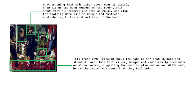

This CD cover has a lot of abstract imagery used, which can be because the band 'Kasabian' are very well known in the indie rock scene, and so they can get away almost by using this abstract and different approach that most unknown bands/artists may not be able to use effectively.
Although the front cover has a very abstract feel, with band members wearing very traditional and old-fashioned clothing, it does clearly show to the audience who is in the band, allowing then to recognise and familiarise themselves with the band members.
Compared to the 'Razorlight' CD cover (shown below), much darker and more sinister colours are used throughout the cover, which automatically helps the audience to draw a clear distinction towards the two bands. As although they may both be part of the indie rock genre, it is clear from both the representation of the bands through their CD cover and their music itself they have different moods and atmospheres, separating the two.
The font used in this CD cover is again like the 'Razorlight' very clear to read, but has a much more rougher and harder feel to it, with straight lines used, instead of more curved lines used in the 'Razorlight' CD cover. This gives 'Kasabian' a more rougher and darker tone to the band itself due to this chosen font.

This CD has a clear meaning and concept to it. Because the band may not be well-known (or at least at the time of release), clearly showing the band members themselves on the front of the cover allows the audience to recognise and become used to seeing the members, which can help to get there name out there and become more popular and known in the public eye.
Furthermore, clear colours are used to back up the previous point, as it helps the band themselves to stand out and help them become recognisable.
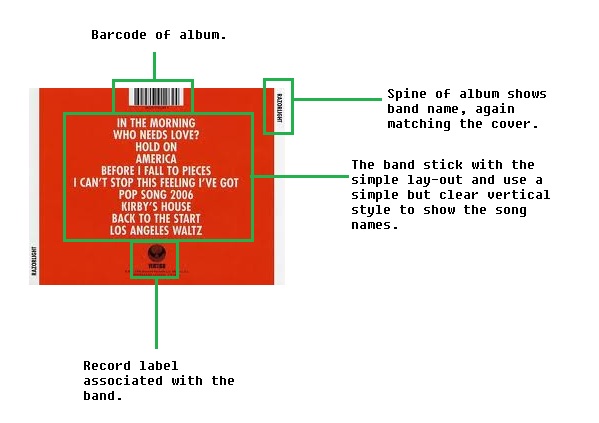
The font style and colour are very simple and allows the important information to stand out from the also simple background colour. By having a single colour front and back of the CD cover it allows the simple style of the whole CD cover to be applied throughout the whole cover, keeping it consistent. The font style also matches the clear layout, as a easy to read font is chosen to again help keep the layout and style of the CD cover consistent throughout.


This CD cover has a lot of abstract imagery used, which can be because the band 'Kasabian' are very well known in the indie rock scene, and so they can get away almost by using this abstract and different approach that most unknown bands/artists may not be able to use effectively.
Although the front cover has a very abstract feel, with band members wearing very traditional and old-fashioned clothing, it does clearly show to the audience who is in the band, allowing then to recognise and familiarise themselves with the band members.
Compared to the 'Razorlight' CD cover (shown below), much darker and more sinister colours are used throughout the cover, which automatically helps the audience to draw a clear distinction towards the two bands. As although they may both be part of the indie rock genre, it is clear from both the representation of the bands through their CD cover and their music itself they have different moods and atmospheres, separating the two.
The font used in this CD cover is again like the 'Razorlight' very clear to read, but has a much more rougher and harder feel to it, with straight lines used, instead of more curved lines used in the 'Razorlight' CD cover. This gives 'Kasabian' a more rougher and darker tone to the band itself due to this chosen font.


This CD has a clear meaning and concept to it. Because the band may not be well-known (or at least at the time of release), clearly showing the band members themselves on the front of the cover allows the audience to recognise and become used to seeing the members, which can help to get there name out there and become more popular and known in the public eye.
Furthermore, clear colours are used to back up the previous point, as it helps the band themselves to stand out and help them become recognisable.
The font style and colour are very simple and allows the important information to stand out from the also simple background colour. By having a single colour front and back of the CD cover it allows the simple style of the whole CD cover to be applied throughout the whole cover, keeping it consistent. The font style also matches the clear layout, as a easy to read font is chosen to again help keep the layout and style of the CD cover consistent throughout.


Lastly, this CD cover has again like 'Kasabian' a very abstract and different image used as the front cover. Again, it does show the band members off slightly, but the main focus is off the owl image used in the centre of the cover, which matches the title of the CD itself ('Only By The Night').
The colours used on the CD cover are very similar to that used in the 'Kasabian' cover, as they are much darker in the tone, especially the front cover. Whereas the back of the CD cover uses a simple white background, which contrasts with that of the front colour. It does however allow the font of the track list to stand out even further.
The font itself, on the back of the cover, is very different and bold and allowing the song titles to stand out, which can attract the audience. The colours, similar to the font, are also very bold in colour, which further allows the song titles to stand out. However, on the front of the cover, the font used for the band name and CD name are very small, which allows the main focus of the CD cover to be on the image itself, rather than the text, which allows for the CD to be very eye-catching and attractive.
These 3 CD covers have a few things in common with each other. All three show of all of the band members. The genre of indie rock is unlike the pop or dance genre, as it doesn't tend to use abstract images, instead they present the whole band together which allows the audience to see everybody.
They also all have all information associated with a CD cover, such as record label that the band is associated with, the barcode and band website. Although these things are very obvious, they are essential for creating a successful CD cover that looks professional and is also informative for the audience and gives them places to go if they are in search of extra information.
Also, some of the CD's do use some sort of abstract features in the CD cover. Kasabian and Kings of Leon both use abstract features in their CD cover, either in the clothing worn by the band members, or the way they are presented, with the Kings of Leon album presenting the band members as part of an eagle head.
The covers also use similar colours, with plain colours used, such as white, black, dark blue and dark green used. This keeps the tone of the album fairly neutral and not too in your face and garish, again like pop and dance CD covers.
Overall, indie rock CD covers are fairly simple in their execution but very effective as it presents the band well and keeps the tone of the album neutral to appeal to a wide variety of audiences, which allows these bands to get their music out to a lot of people, increasing their popularity.
Sunday, 16 September 2012
Genre research 1
Below is a mood board showing the image of the genre indie rock and how singers/bands of this genre are presented:

Thursday, 13 September 2012
Theories 3
Below is a bubbl outlining the key ideas of Andrew Goodwin's theory towards editing:
Illustration


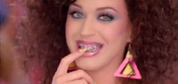

In this example, again the band members play roles that are the complete opposite of them in real life. The band members are male but instead play the role of women in the music video. This created a comical element to the video, making the audience laugh and remember the video for its quirkiness. Again the band are well established, so they take no risks in doing a disjuncture music video. Videos are like these are very effective as they are very memorable and become instant classics, meaning they are more appealing and attracting towards the audiences.


Illustration
In this example, shots of images that relate to the lyrics are used, such as a microphone and a sound mixer. This is very simple but effective as it clearly portrays the lyrics and meanings over to the audience. The lighting used in these shots are also lit very well, adding to the simplicity of the music video. The editing used in the video, as stated in Goodwin's theory cuts on the beat, making the atmosphere very upbeat and full of rhythm. And lastly, the music star in the video is dressed as he usually is, again meeting the theory of Goodwin.


In this second example it also meets all of the criteria of Goodwin's theory. In this example simple shots of objects that again match what is being said in the song are used, this is simple but with good framing and lighting it makes it very effective. Also, in the video the music star is dressed how the audience expect her to be, which is a teenage school girl. Again this meets the lyrics of the song, making it very effective, simple and clear.


Amplification
The next two examples are from the same band. This links with the point Goodwin made, that established music stars are more likely to make quirky and different films as there is less of a risk. In these two music videos the band characters play fictional characters that relate to the concept/narrative of the music video (in this case an airplane flight and the other a man on his way to band practice). Because these videos are so different, they stay in the mind of the audience and are more likely to come back and watch the video again and again.


Disjuncture
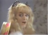
In this example there is a clear disjuncture feeling with the music video. As you can see by the images below, the main character is presented as a nerd, this completely contrasts with how she is in real life, which is a glamorous music star known world wide. This world wide known stardom is one of the reasons that she can get away with making a music video such as this, as it is seen as less of a risk, as her fans are sure to like it. The mise en scene and performance of the music star is a key reason why this video is so effective, as without it the presentation of her being a nerd would not be so realistic or believable.


In this example, again the band members play roles that are the complete opposite of them in real life. The band members are male but instead play the role of women in the music video. This created a comical element to the video, making the audience laugh and remember the video for its quirkiness. Again the band are well established, so they take no risks in doing a disjuncture music video. Videos are like these are very effective as they are very memorable and become instant classics, meaning they are more appealing and attracting towards the audiences.


Tuesday, 11 September 2012
Sunday, 9 September 2012
Wednesday, 5 September 2012
Low Budget Ideas
I have watched two low budget music videos (below), from watching and analysing them I have learnt many new practical skills that when combined make a very effective music video. I should also follow the steps that these low budget music videos took myself in order to create a very successful music video.
Imogen Heap - 'A-ha!':
The Fix - 'Just Got Paid':
- In the music video by The Fix, they used lots and lots of close ups showing individuals from the group. This was very effective as the shots themselves were framed very well, these shots were then followed by either another close up or a mid shot of the whole group singing or dancing.
- The group members of The Fix are also very energetic and active, even if they aren't singing or in one particular shot. This makes the video more entertaining as now the focus is on the whole group and not the one individual singing. It also makes the whole atmosphere of the video seem more upbeat and energetic, matching the energy of the song, which is again very effective.
- The editing in 'A-ha!' is highly effective. The speed and pace of the editing is very rapid, matching the pace of the song. This makes the video seem as one with the song, and makes very enjoyable viewing for the audience.
- The costumes and props used in both videos match the genre and feel of the song very successfully. In 'Just Got Paid' the boys wear very modern and fashionable clothing to appeal to the audience, and to also match the song which is also very modern. They also wear very similar clothing to match one another and to show they are a real music group. Whereas in 'A-ha!' the clothing is much more darker with lots of black used to highlight and reinforce the darker and more sinister feel of the song. Props used in 'A-ha!' are also very effective as they again match the sinister feel of the song with the use of ropes etc.
- The location in 'A-ha!' again matches the feel of the song, with dark low key lighting used to again highlight and reinforce the darkness of the song.
- The location in 'Just Got Paid' is very simple, but is also very spacious to allow all of the members to move freely without hitting one another.
- Effects are used effectively in 'A-ha!' helping to reinforce the sinister and creepy feel of the song.
- All of the shots in both music videos are framed very well, cutting off no heads etc, and held steady especially when a camera movement such as a track or pan is being used. This helps to make the video look more professional and improve the overall quality.
- Lastly, both music videos have great performances from everybody. This is very key as is the performance is boring then the video will also seem very boring to the audience.
Imogen Heap - 'A-ha!':
The Fix - 'Just Got Paid':

Tuesday, 4 September 2012
Analysis of rock video 3
Red Hot Chili Peppers - The Adventures of Rain Dance Maggie
Locations
This music video only uses one location, which is a city building near the beach. The whole building is used in the sense that the band themselves are playing on the rooftop of the building, while fans and bystanders watch from the bottom of the building. Although it may be sometimes boring or bland to only use one location in a whole music video, it is used very effectively as a variety of shots are used to make the location used very interesting for the viewer.

Clothes
The band wear mainly black clothing in the video, which meets the stereotype of rock band members. However, one of the band members has dyed bright blue hair. This goes against the stereotype and contrasts the dark clothing of the rest of the band. This is very effective also, as it makes the blue hair stand out even more, making it even more prominent. The black clothing also makes the band seem very rebellious and outgoing, which is reinforced by the fact that the singer of the group is wearing a blazer but no shirt, this is very out of the ordinary and is a statement to society that this band isn't conformist like many other bands.


Props
The props used in the music video are very ordinary for a rock video, with the only props being guitar, drums and a microphone. Although this is very simplistic, it can be seen as effective as it means there is an emphasis on the music itself, with more time being spent showing off the instruments rather than other props, which is what the viewers want to see, the music.

Cinematography
Lots and lots of long shots are used in this music video, giving the feeling that these shots are filmed from a helicopter. The fact that it feels like its being filmed from a helicopter also hints that the band isn't allowed to be there on the rooftop, as these long shots give the feeling that its a news report on how they are not allowed to be there.


There are also shots of the fans at the bottom of the building, showing their reaction to the band on the roof. The reaction of the fans also reinforces the idea that the band is not allowed to be there as they are really surprised and shocked at them being there. These shots also show the mass support that the band is getting as there are many birds eye view shots showing the mass of people watching the band. Also, because it is by the sea there are many shots of the surrounding environment.
Lastly, there are also close ups of the band, showing them singing and playing their instruments, especially when these instruments or the vocals are very prominent of the song.
Concept/Narrative
The concept of this music video, like mentioned before, is that the band is not meant to be on the rooftop, with the long shots reinforcing this as it hints that the video is a news report. This concept is very simple as it is fairly easy to carry out, but also very effective as it is executed very well due to its simplicity, meaning the production of the video is very high.
Effects
A couple of focus pulls are used in the video, showing the switch of emphasis from the environment and the setting to the band members. It also shows the audience how close to the sea the band are.


Titles are used at the beginning of the video, not only do these tell the audience where and when the video was filmed. It also further again reinforces the idea this is a news report by the way it is informing the audience about the location, rather than just showing it, which is a staple of a news report. This whole idea of the video being filmed in a news report style also gives the band a very rebellious and outgoing representation as they are seen as doing wrong, by playing on the rooftop, which will attract the audience as people like to see people being different and rebellious towards society.


Montage editing is used in this music video, as the band is shown at different points of the day. This montage editing is used very effectively as it shows the progression throughout the day of how more and more people stop and watch the band while they play on the rooftop.


Monday, 3 September 2012
Thursday, 30 August 2012
Analysis of pop video 2
Justin Beiber - Boyfriend
Locations
The main location used in this music video is sunny, bright rooftop. The brightness of this location gives off a very positive and a party atmosphere, which is reinforced by the high energy of both Justin Beiber himself and the other dancers in the video.
Also, the location is very out of the ordinary for a teen orientated music video, this gives out the impression that this isn't an ordinary music video, which will help entice even more people to watch.

Clothes
Clothes
The clothing on both Justin and the other characters in the music video are very bright and colourful, to give off a positive and energetic feel to the music video. This colourful clothing also catches the eye of the viewer, who are mainly made up of teenagers and younger children, as this is also what they would wear in their everyday life when out with friends, like in this video.
The clothing in this video is also designer orientated, this shows that Justin Beiber is very modern and up to date with what children and teenagers are wearing in this era. This also makes him very appealing to the audience, as he is presented as just like them.

Props
There are a variety of props used in this music video, each giving off a different image and feeling.
Cars are used in the music video, which portrays the characters in a very cool and modern light, as these are just ordinary cars, must the best cars that money can buy. This makes Justin Beiber seem as a superstar that he can have all of these cars, which portrays him a role model light for viewers who may want to follow in his footsteps.

Blacked out glasses are worn by a number of characters in the music video, including Justin. This again portrays him as a very modern and cool character as this is what also the younger generation wear, so to own a pair of these glasses makes them feel that they can be like Justin Beiber.

Lastly, a guitar is used by Justin in the music video. The use of this guitar portrays Justin as a very talented musician who can sing and play guitar. This again makes him a role model that the audience aspire to be as he is a very successful musician.

Cinematography
The video starts with a very abstract montage of Justin with a girl. The cold lighting used in this sequence contrasts with the lighting and tone of the rooftop later in the video.This montage scene could be Justin's dream or his mind, which relates to the song title of 'Boyfriend', as it is clear to see he has feelings for her.

We also see dripping water, which again is very abstract. It is seen dripping in time with the music, which helps to give the audience a sense of beat and timing of the music.

On the rooftop there are many shots of the dancers dancing together in time, laughing and smiling, which gives off a real party atmosphere that makes the viewers themselves also feel in a party mood as this atmosphere is portrayed throughout the music video.


Concept/Narrative
The narrative of the music video is very clear and fits in perfectly with the title of the song. It's clear that Justin wants this girl to be his girlfriend. The montage scene at the beginning shows his true feelings for her, which sets the scene for the rest of the video. As the video progresses the two characters gradually get closer and closer to one another showing again their feelings towards one another. The audience can then see at the end of the video that the two are very close with one another, showing that Justin has finally got his wish of being her boyfriend.


Effects
The main effect used in the music video is slow motions. There is a slow motion at the beginning of the video of water dripping.
There are also slow motions used later on in the video of cars performing stunts and driving around, showing to the audience how special these cars are.

Slow motions are also used when showing the other characters in the video, showing them off glamorously to entice the viewers even more.

Continuity/Montage
The editing used in this music video is montage editing, showing the progression of Justin and the girl getting closer and closer to one another. Shots of dancers and cars are also used in between to keep the audience interested in the video and to hook them in to continue watching.
Subscribe to:
Posts (Atom)