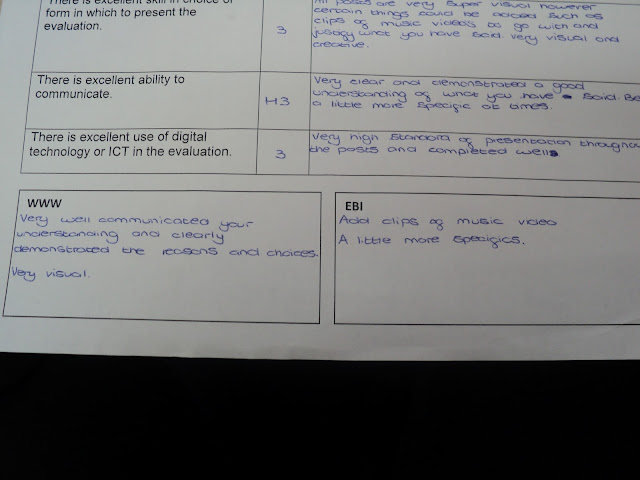
Below shows my feedback for my evaluation section of my blog. As you can see I was able to achieve my target grade, meaning I had no huge changes to make to my work.
Harry Smith
Friday, 3 May 2013
Music Video Teacher Feedback 2
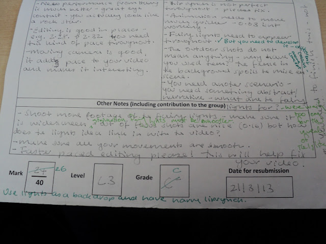
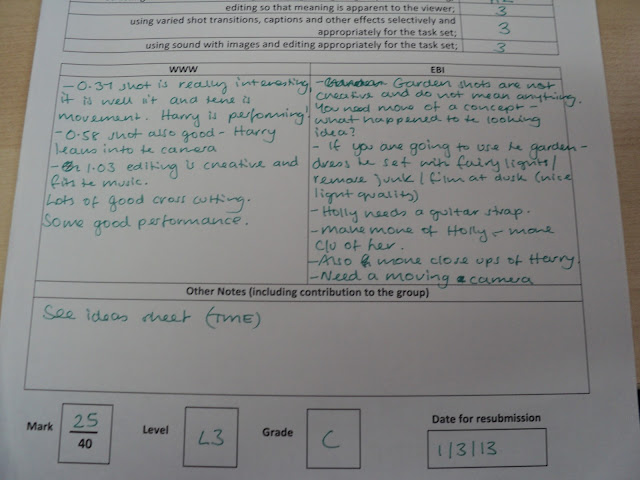
Below shows the teacher feedback for my music video. As you can see I only achieved a C on this piece of work, meaning I wasn't able to achieve my target grade.
This meant that I had to go out and re-film a lot the sections of my music video to allow for myself to achieve a higher grade. Also, I had to ensure that the editing of my video was effective in matching the feel and mood of the song itself.
Evaluation Peer Feedback
Below shows the peer feedback for the evaluation section of my blog. As you can see I achieved a B+ on this part of my work. Although this is good it does still not meet my target grade of an A, meaning a bit more work has to be put in to ensure that I achieve my target grade.
Planning Teacher Feedback
Below shows my teacher feedback for the planning section of my blog. As you can see, although I did achieve an A it was an A-, meaning I would have to put in a bit more work to ensure that I achieved a solid A.
Music Video Teacher Feedback
Below shows the teacher feedback for my music video. As you can see I only achieved an A on this piece of work. This means a lot of work would have to be put in to ensure that I was able to achieve my target grade of an A.
Ancillary Tasks Peer Feedback
Below shows my peer feedback for my ancillary tasks. Although I was able to achieve a B for this section of my work, it still didn't meet my target grade of an A. This means some more work and re-shooting of pictures would have to take place for me to be able to meet my target grade of an A.
Thursday, 14 March 2013
Monday, 4 March 2013
Q4) How did you use media technologies in the construction and research, planning and evaluation stages?
Research
During this stage of my coursework I used a lot of technologies. Probably the most used technology during this stage was the website YouTube. Although this may be seen as a very simple technology to use, it did allow me to scope out the conventions of the indie rock genre, which allowed me to see what had to be included when I started to create my own video. Also, because of the huge size of YouTube, it allowed me analyse a wide variety of video from my chosen genre, giving me a full picture of what was needed.
Another technology I used was Google Docs. This allowed me to create a simple survey which was then sent through email to a large number of recipients, all of which fell into my target audience. Because I was able to send this survey to such a large variety of people, it allowed me to see exactly what the audience wanted to see in all three products I had to create. These points I then made sure were implemented into my music video, digipak and advertisement to some degree as it is what my target audience wanted to see.
Planning
During this stage I got to put my editing skills to the test through the production of an animatic through my storyboards. By creating this animatic it not only gave me some experience with the Final Cut Express software but it also allowed to visualise what order of shots I wanted to see in my final music video.
Blogger was also particularly during this stage as it allowed me document all of my work, which I could then look back at to follow. Without this documentation of work and ideas I may have forgotten some aspects, however Blogger eliminated this possible risk.
Another technology that was prevalent during this stage was the extensive use of email. Between me and my other group members, emails allowed us to be in constant contact with each other to plan dates to film etc. Emails were also used with teachers and other students who would be used in our music video. Again, emails allowed us to document any important messages, such as the dates and times for filming to ensure they were not forgotten.
Construction
The video camera was one of the most important technologies, along with the digital camera, in this stage. Without these technologies, gaining the footage to work with in post-production stages would not be possible.
Post-production software, such as Photoshop and Final Cut Express were also just as important as they allowed me to alter photos with effects and layers to create a certain mood and look to them. The more detailed software of Photoshop, compared to similar packages such as Paint, allowed more effects to be used, allowing to create a more professional overall product. Final Cut Express can also be compared to iMovie in the fact that it is much more professional and allows the user to edit clips more effectively.
Lastly, lighting rigs were also used in the construction stage of my coursework as they helped to create a more effective mise en scene for filming in. The use of this technology helped to give locations used in my music video a different dimension that would have been lacking without the use of these lights. It also helped to develop my skills in how to use these lights and also how to consider mise en scene when filming.
The video below shows all of the technologies that I have used during all stages of my productions.
Q4) How did you use media technologies in the construction and research, planning and evaluation stages?
Below is an overview of the technologies that I have used during my A2 coursework.
Q3) What have you learned from your audience feedback?
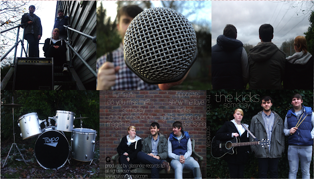
The first piece of feedback I received was when I carried out my Audience Research before I started my projects. From gaining this feedback, which was aimed at the target audience for my genre, I was able to draw up similarities in the answers from my Audience. Below shows how the majority of my audience wanted to see dark colours in both my digipak and advertisement. They also wanted to see the band used extensively in both of these products as it reflects the conventions of my chosen genre, and also helps to clearly show to the audience who is involved in the band.
Also, by further studying these results I found other questions that were answered very heavily for one side.
For example, 90%+ wanted to have some sort of link between both the digipak and the advertisement.
Also, by further studying these results I found other questions that were answered very heavily for one side.
For example, 90%+ wanted to have some sort of link between both the digipak and the advertisement.
Through seeing this, it helped me to realise that what the audience wanted would help to make the style and image of the band much more recognisalbe, and would also make both the products look more professional.
This aspect I feel I may have ignored at first when creating both of these products, as although I felt they had a fairly professional look to them, there was no link between the two.
However, I soon realised that following the audience feedback that I had received would make my products much better for not only the audience to look at, but also for the band to gain more publicity as their style could now be easily recognised.
Before:


After:
As you can see, before the two products had no real link between the two, excpet for the fact that images of the band were present in both.
However, after a few simple changes, the two products look more of a set rather than totally different. This meets the audience feedback and also makes the products more effective.
Monday, 25 February 2013
Sunday, 24 February 2013
Q1) In what ways does your media product use, develop and challenge forms and conventions of real media products?
On the left you can see the six different panels of my digipak, whereas on the left is several indie rock CD covers.
As you can see, there are several things that mine and the professional CD covers have in common, however there are also some differences between the two which help to distinguish them apart.


Firstly, my digipak does not have an image of the band members as it's front cover, which is seen as a convention for most indie rock CD covers. Instead I have an image of a smashed light bulb, which helps to play off of the album title of 'Illuminate'. This theme off of the word 'Illuminate' is reinforced through the use of fairy lights on some of the digipak images. I feel that this helps to give the digipak a flash of light throughout, which allows is to have a dynamic edge that is needed to create a successful digipak. This challenging of this convention allows my digipak to have a clear sense of identity and uniqueness about it.
Although my digipak may not have the band on the front cover, this convention is met to some degree as several images of the band are used throughout the other panels of the digipak. It is also important that these images of the band do not include them using their instruments. This is because this is one of the conventions of the indie rock genre (which can be seen by the gif on the left). This is because the digipak tends to give off a more relaxed and laid-back feel compared to a music video for example.
This feeling of a laid-back attitude in the digipak can also be seen by the back cover of my digipak. The image on the back cover is of the band members laughing and having a good time. This meets this convention used in other professional digipak's. Meeting, rather than challenging this convention means the digipak maintains its clear image of the indie rock genre.
Lastly, my digipak has a clear colour scheme running throughout it. These colours are of a brown/black tone, which meets that of the professional CD covers on the right. This again helps to give my product a clear image and makes it easily recognisable as a product from the indie rock genre. This is very important as making sure the audience can instantly recognise which genre the band is from which is key to creating a successful digipak.
As you can see, there are several things that mine and the professional CD covers have in common, however there are also some differences between the two which help to distinguish them apart.
Firstly, my digipak does not have an image of the band members as it's front cover, which is seen as a convention for most indie rock CD covers. Instead I have an image of a smashed light bulb, which helps to play off of the album title of 'Illuminate'. This theme off of the word 'Illuminate' is reinforced through the use of fairy lights on some of the digipak images. I feel that this helps to give the digipak a flash of light throughout, which allows is to have a dynamic edge that is needed to create a successful digipak. This challenging of this convention allows my digipak to have a clear sense of identity and uniqueness about it.
Although my digipak may not have the band on the front cover, this convention is met to some degree as several images of the band are used throughout the other panels of the digipak. It is also important that these images of the band do not include them using their instruments. This is because this is one of the conventions of the indie rock genre (which can be seen by the gif on the left). This is because the digipak tends to give off a more relaxed and laid-back feel compared to a music video for example.
This feeling of a laid-back attitude in the digipak can also be seen by the back cover of my digipak. The image on the back cover is of the band members laughing and having a good time. This meets this convention used in other professional digipak's. Meeting, rather than challenging this convention means the digipak maintains its clear image of the indie rock genre.
Lastly, my digipak has a clear colour scheme running throughout it. These colours are of a brown/black tone, which meets that of the professional CD covers on the right. This again helps to give my product a clear image and makes it easily recognisable as a product from the indie rock genre. This is very important as making sure the audience can instantly recognise which genre the band is from which is key to creating a successful digipak.
Digipak and advertisement progression
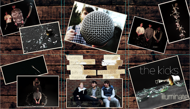
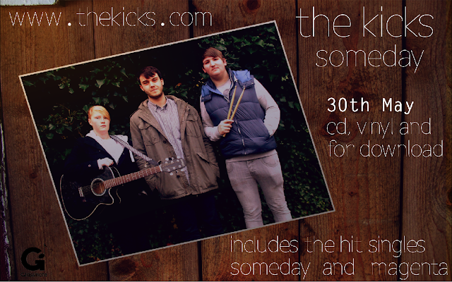
Below is our current digipak and advertisement design. A few changes have been made, especially to the digipak design. The most notable change is the inclusion of the wooden background in the digipak, which will keep the design and theme running throughout both products.
Also, we have decided to implement images such as the light bulb images and the images with lights. This is used to play off the fact the album is titled 'Illuminate', and these black background images also match the similarly lit shots in the music video, to help keep some consistency throughout the different products.
Lastly, the track list on the back cover of the digipak has been placed on top of images of masking tape. This matches the use of the same tape in the advertisement, which helps to keep some level of consistency between the two products.
Friday, 1 February 2013
Music video draft 2
Below is our second draft of our music video. Many changes have occurred compared with the previous version, most notably the inclusion of a second performance location.
However, I feel the video can be made better by the inclusion of more dynamic shots and a clear concept throughout.
Digipak/Advertisement progression
Below shows the progression from our second draft of ancillary tasks.
The advertisement has seen further change, with the wooden background changing to a more natural looking shade of brown. This makes the colours throughout the advertisement consistent throughout.
Also, the text and record company logo have been re-adjusted to make it look better as a whole product as before some items of text were too big, such as the website, when they didn't need to be that big.
Lastly, a masking tape image has been used on two of the corners of the image (which has also changed), to give an even further 'indie' feel.
For our digipak, some of the pictures have been changed, which was a problem I identified earlier. This makes it seem more interesting and ensures it doesn't look stale to the audience.
Again, some changes ill have to be made, most notably the lower left and upper right images as we have identified these as the weakest images of the product. I feel these changes would make the digipak look much better.
Tuesday, 22 January 2013
Digipak/Advertisement draft 2
Below are our current digipak and advertisement designs. Not much has changed with our digipak design, however our advertisement has seen a big change.
We have decided to use one of the pictures from our digipak and place it on a wooden background to make it seem more interesting and eye-catching for the audience. This also meets the conventions of our genre as the indie rock genre tend to use unusual and different styles, and this wooden style I feel meets this.
However, there are changes we have to make, especially to our digipak, where a few of the pictures have to be replaced with something much more intriguing for the audience.
Monday, 14 January 2013
Music video draft 1
Below is the first draft of our music video:
As you can see, it is far from finished. Many more shots need to be included in the video, such as the concept, other locations for the performance scenes and also more shots in general for the performance scenes of the band.
As you can see, it is far from finished. Many more shots need to be included in the video, such as the concept, other locations for the performance scenes and also more shots in general for the performance scenes of the band.
Thursday, 20 December 2012
Digipak/Advertisement peer feedback
Below is a short video showing some peer feedback regarding my digipak and advertisement.
Although we did receive some good feedback, most notably the fact that our genre of indie rock was easily recognisable (showing how we have met the conventions of our genre effectively).
However, there are also clear improvements that need to be taken into consideration in order for me to achieve the best results from these two products.
Firstly, some of the pictures used in the digipak need to be framed better. This is because some of the images can be seen as to squashed and out of proportions. This can make the whole feel of the digipak seem unprofessional.
Next, some of the lighting issues on our digipak images need to improved. Some of the panels are too dark, thus making it hard to see what the actual image is. Again this may give off the wrong impression, as it can lead to the whole product again seeming unprofessional.
Lastly, for our advertisement, a new image will need to be used. This is because having the exact same image used for the advertisement and the front cover of the digipak can become repetitive, which is something we want to avoid. Also, the new image will need to have good framing to be able to include all of the information that an indie rock advertisement needs (such as critic review, website and other general information).
Friday, 30 November 2012
Digipak Progression
From the image below you can see how my digipak has progressed from the last post:
As you can see from the template above we have got images for the majority of our six panels. The bottom right we intend to be out front cover of our CD. This is because it clearly shows off the whole band and the roles that they have, which is signified by the guitar and drum sticks. We have also framed the shot well to allow for the band title and the CD title to be added.
The bottom middle panel will be the back cover of our digipak. We chose an image like this as it again shows off the whole band, but this time in a more relaxed and informal tone, to show the different side to the band. Again, we have also left room for font to be added to the image.
The other images used will be the other panels of the digipak. We have chosen these types of images to again show off the band and the instruments used, as this helps to meet the convention of the indie rock genre which is to focus on the music itself of the band.
Friday, 23 November 2012
Digipak Plan
Digipak
Below is an example of the digipak that we plan to make for our indie rock band. As you can see, it is not fully completed but we did this to help give us an idea of what we want to add to the complete version. It also gave us an idea of what sort of effects and shots that we want to use in our digipak and resulting advert for the band.
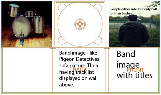
Particularly for the back cover of our digipak, we took inspiration from a photo from another indie rock band, 'The Pigeon Detectives', which showed the band on a sofa with an unusual backdrop. This was very effective as it shows the whole band together in a creative way, as the backdrop looks very effective and meets the indie genre well.
 The record label that we have chosen to use is the record label 'Glassnote Records'. The record label that we have chosen to use is the record label 'Glassnote Records'. We have chosen this label as it is fairly small and represent many bands from our genre also, such as: 'Mumford and Sons' and 'The Temper Trap', which shows that it fits in with the rest of our genre well. This is backed up by the fact that Glassnote Records were named 'Best Indie Label' in an issue of Rolling Stone magazine, again showing how it is very approriate.
Below is an example of the digipak that we plan to make for our indie rock band. As you can see, it is not fully completed but we did this to help give us an idea of what we want to add to the complete version. It also gave us an idea of what sort of effects and shots that we want to use in our digipak and resulting advert for the band.

Particularly for the back cover of our digipak, we took inspiration from a photo from another indie rock band, 'The Pigeon Detectives', which showed the band on a sofa with an unusual backdrop. This was very effective as it shows the whole band together in a creative way, as the backdrop looks very effective and meets the indie genre well.
Track-list
Me and my group also decided to use 10 songs for our track-list, as from our research this is what we perceived as an average amount to use.
Also, because of the indie genre that we have chosen to follow, the track-list will contain some very abstract and unusual titles.
For example the track 'Last Song' although is very simple as it is the last song of the album, it is still unusual to see such an illustrative title for a song used on an album.
The full track-list can be seen below:
Record Label
 The record label that we have chosen to use is the record label 'Glassnote Records'. The record label that we have chosen to use is the record label 'Glassnote Records'. We have chosen this label as it is fairly small and represent many bands from our genre also, such as: 'Mumford and Sons' and 'The Temper Trap', which shows that it fits in with the rest of our genre well. This is backed up by the fact that Glassnote Records were named 'Best Indie Label' in an issue of Rolling Stone magazine, again showing how it is very approriate.
Wednesday, 7 November 2012
Planning Peer Assessment
Below you can see the scanned in documents, showing a peer assessment done on the planning section of my blog.
As you can see I have achieved one grade lower than my target grade, however, with the improvements that I have received it means that I can work towards my target grade and after the changes that are needed I can hopefully stay on track to achieve my target grade of an A.
Tuesday, 6 November 2012
Shooting Schedule
Below you can see our shooting schedule. This schedule allows us to be fully organised when it comes to deciding which dates and at what time we will be filming, meaning that all time will be spent on actually filming our music video rather than worrying about times etc.
Shooting scedules are very important as it ensures that all group members know what is happening on the day of filming and what to bring. There are also sections where any additional information can be added, such as a reminder to book the equipmet, which again is alsovery important.
However, a secondary shooting schedule needed to be created as more footage had to be shot. This was due to feedback on our videom which stated how extra footage was needed to improve my video.
Photo shoot plan
Below is our photo shoot plan for our advert and our CD package. Similar to our shooting schedule, the photo shoot plan allows us to outline what we want to do on each date, in the specific time period, and where and what we will need. By using a photo shoot plan such as the one below it ensures everybody in the group is organised and knows what they are doing.
A photo shoot plan is very important as it again makes sure everybody is on location at the correct time and ensures there are no problem on the day of the shoot.
However, further images needed to be taken to improve my digipak and advertisement based upon the feedback I had received from peers and teachers.
Thursday, 1 November 2012
Track permission letter
Below is an image showing how me and my group have gotten in contact with the band via email to request permission to use their track in our work.
It is important to do this as ensures that we are not breaching any copyright or legal issues that may be in place and also that we are not using the song for any profitable needs.
Talent release forms
Below is a scanned document of our talent release forms. These are very important as they ensure that permission from the actor/performer who we want to be in our video is gained. It also ensures that no laws are broken or breached, which is a very important issue when creating any type of film or video.
Below show the three talent release forms, for the three performers in my music video:
Location permission letters
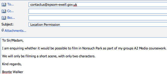
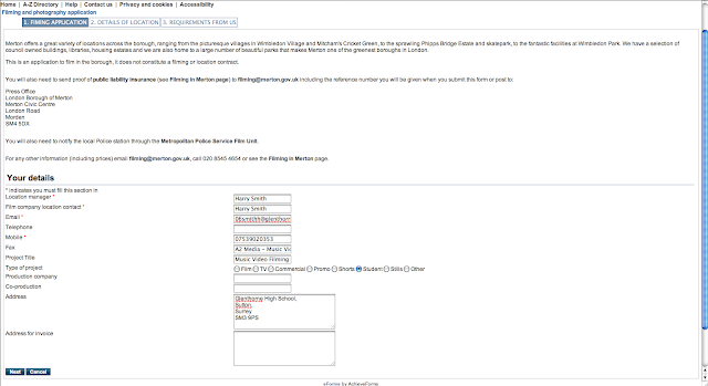
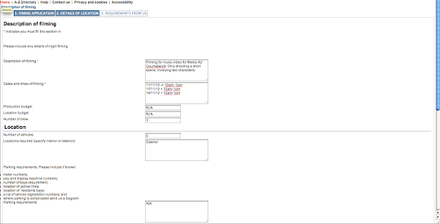
Below are images of how we got in touch with either the council, regarding using the park locations in our music video. And also the personal email of the owner of the loft we intend to use.
Permission for use of Nonsuch Park:
Permission for use of Morden Park:

Permission for use of loft:

As you can see we had to use a variety of methods to get in contact to gain permission to use the locations we desired. We had to use both email and application forms to get in contact.
It is very important to gain permission to use location before you actually start filming the music video, as otherwise you may be breaking a law as you have no permission to be there. It also notifies who it may concern when and how long you will be using the location for, so they will be aware of your presence.
Permission for use of Nonsuch Park:

Permission for use of Morden Park:


Permission for use of loft:

As you can see we had to use a variety of methods to get in contact to gain permission to use the locations we desired. We had to use both email and application forms to get in contact.
It is very important to gain permission to use location before you actually start filming the music video, as otherwise you may be breaking a law as you have no permission to be there. It also notifies who it may concern when and how long you will be using the location for, so they will be aware of your presence.
Subscribe to:
Comments (Atom)


